こんにちは、しまみさです。
今回は、画像の上に要素をずらして重ねる方法をご紹介します。
このようなデザインを実装していきます。
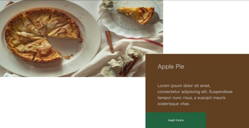
コーポレートサイトはもちろん、ECショップやポートフォリオサイトなど、ジャンルを問わず色々なサイトで見かけるレイアウトではないでしょうか。
個人的に、素敵だな〜と感じるサイト内では高確率で使われているデザインです!
しかし、コーディングしにくそうだな…と苦手意識をもっていました(>_<)
ですが、意外と簡単に実装できるので、備忘録を兼ねてご紹介します。
- レスポンシブ対応
- HTMLとCSSのみでできる
完成形のコード
See the Pen Overlay elements on top of the image by mimimimi (@shimamisa) on CodePen.
HTML
<section class="introduce">
    <div class="sectionWrapper">
        <div class="contentWrapper introduceRelative">
            <div class="content">
                <div class="content_inner">
                    <h2 class="title">
                        Apple Pie
                    </h2>
                    <p class="text">
                        Lorem ipsum dolor sit amet, consectetur adipiscing elit. Suspendisse tempor nunc risus, a suscipit mauris scelerisque vitae.
                    </p>
                    <div class="more_btn">
                        <a href="./introduce.html" class="btn">
                            read more
                        </a>
                    </div>
                </div>
                <div class="img_wrapper">
                    <img src="https://drive.google.com/uc?export=view&id=1FK1j5toHO1nKccThqlQ7KWx70TtMvBvq" alt="apple_pie">
                </div>
            </div>
        </div>
    </div>
</section>
CSS
html {
    font-size: 62.5%;
}
body {
    font-family: 'メイリオ', 'Meiryo', sans-serif;
    font-size: 1.6rem;
    color: #C0C0C0;
    background-color: #ffffff;
}
img{
    width: 100%;
}
.sectionWrapper {
    padding: 60px 0;
}
.contentWrapper {
    max-width: 1240px;
    margin: 0 auto;
    padding: 0 30px;
    position: relative;//相対配置
    z-index: 1;//画像の前面に出すため
}
.introduceRelative {
    padding-top: 220px;//ブラウンのボックスの上の余白※適宜調整してください
}
//ブラウンボックスのスタイル
.content {
    width: 549px;//幅※適宜調整してください
    max-width: 70%;//幅※適宜調整してください
    margin-left: auto;//右寄せ
    padding: 2rem 0 0;
    background-color: #604020;//ボックスの色※適宜調整してください
}
.content_inner {
    max-width: 85%;
}
.title {
    margin-bottom: 6.2rem;
    font-size: 3rem;
    font-weight: normal;
}
.text {
    margin-bottom: 3rem;
    font-size: 2rem;
    line-height: 1.6;
}
.title ,.text {
    margin-left: 64px;
}
a.btn {
    text-decoration: none;
    display: inline-block;
    -webkit-transition: all 0.3s ease-in-out;
    -moz-transition: all 0.3s ease-in-out;
    -ms-transition: all 0.3s ease-in-out;
    -o-transition: all 0.3s ease-in-out;
    transition: all 0.3s ease-in-out;
    padding: 3rem 0rem;
    text-align: center;
    width: 320px;
    background-color: #206140;
    color: #F5F7FC;
}
a.btn:hover {
	transform: translateY(-4px);
}
//画像のスタイル
.img_wrapper {
    width: 60%;//※適宜調整してください
    position: absolute;//絶対配置(.contentWrapperが相対配置)
    top: 0;//※適宜調整してください
    left: 20px;//※適宜調整してください
    z-index: -1;//ブラウンボックスの背面に配置するため
}
.img_wrapper img {
    height: 411px;//※適宜調整してください
    object-fit: fill;
}

//レスポンシブ用
@media (max-width: 768px) {
    .contentWrapper {
        padding: 0 15px;
    }
    .introduceRelative {
        padding-top: 52%;
    }
    .content {
        width: 85%;
        max-width: 100%;
    }
    .content_inner {
        width: 80%;
    }
    .title {
        margin-bottom: 3.5rem;
        font-size: 2.5rem;
    }
    .title ,.text {
        margin-left: 3rem;
    }
    .img_wrapper {
        width: 80%;
        left: 15px;
    }
    a.btn {
        width: 80%;
        padding: 3rem 0rem;
        text-align: center;
    }

}

@media (max-width: 425px) {
    .introduceRelative {
        padding-top: 55%;
    }
    .title {
        font-size: 2.5rem;
    }
    .text {
        font-size: 1.8rem;
    }
  a.btn {
        padding: 2rem 0rem;
    }
    .img_wrapper img {
        height: 230px;
    }
}
ポイント
- position:absolute;で画像を絶対配置にし、top/right/bottom/left プロパティで位置を指定する
- z-indexを使って、前面・背面配置にする
画像の位置や、余白、幅などの数値は適宜変更してみてください!
他の実装の方法もあると思いますが、ぜひ参考にしてみてください。
それでは(*^^*)!